Why Call to Action Optimization

Call to Action or CTA – the last stage of your conversion funnel that decides the fate of all your marketing efforts. It is such a small part of your website that it can be easily overlooked despite being so crucial. But without an attention-grabbing & persuasive call to action, a healthy conversion rate cannot be attained.
The color, content, placement, & design are the key factors that decide the effectiveness of your CTAs.

Color & design are two things that make your CTA stand out on a webpage and help in grabbing user’s attention

Content & placement of your call to action decide how effective & persuasive it is after grabbing user’s attention

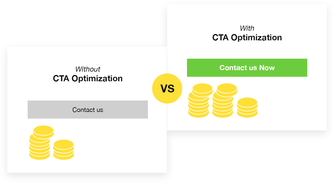
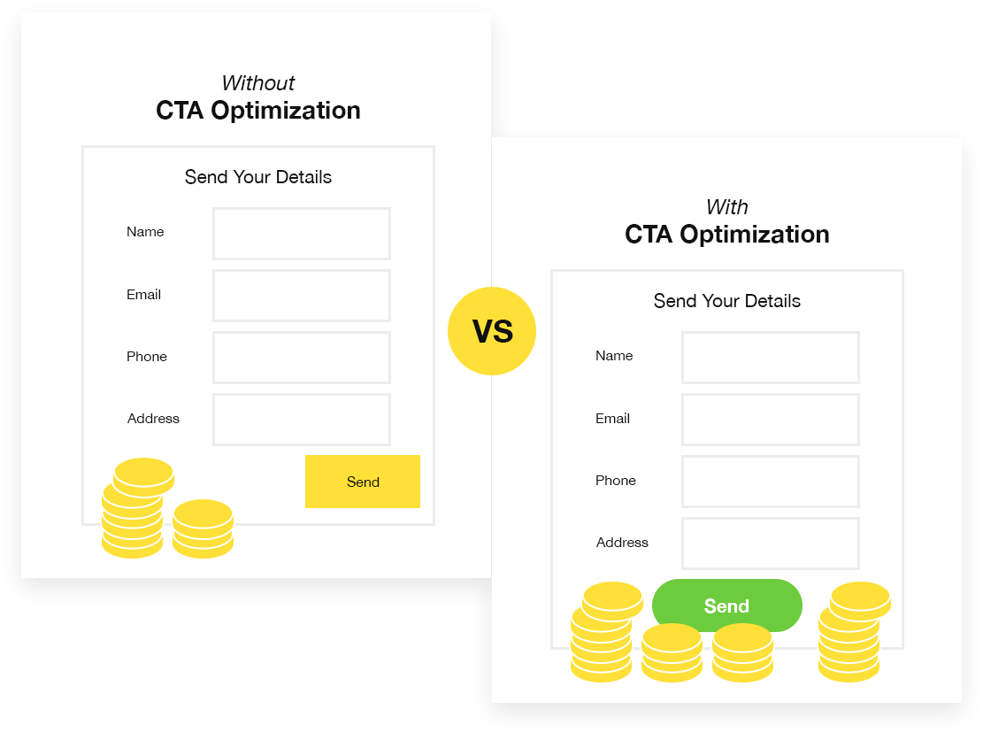
Increase your website’s conversion rate with CTA optimization

A/B Testing

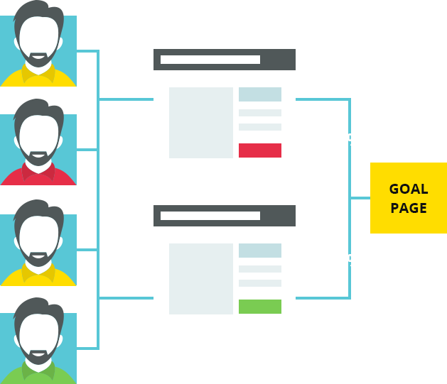
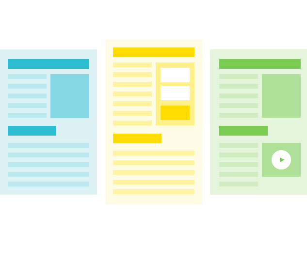
We compare two slightly different versions of a CTA copy to see which one works better. We test these copies by implementing following alterations (one at a time):

  • Different button color
  • Different button text (content, font, size, color)
  • Different button position
  • Different button design

Multivariate Testing

We analyze the performance of your CTA by altering its multiple aspects. We try different combinations based on variation in user behavior & keep iterating until the optimum combination is achieved. We:

  • Test for different combinations of textual & visual elements
  • Test for text & button color
  • Test for position & design, and so on

Split URL Testing

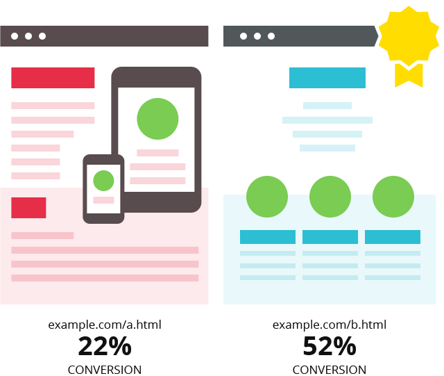
Through Split URL Testing, we check multiple versions of a CTA on different URLs to test which CTA version goes well with which page. We analyze CTAs’ performance on following parameters:

  • Page visits
  • Time spent on the page
  • Number of form submission
  • Link clicks

Browser Testing

We test your CTA’s visibility & appearance in different computing environment to make sure it is equally effective across the platforms. We analyze CTAs on:

  • Different browsers
  • Different operating systems (Android, iOS, Windows, Mac OS)
  • Different screen sizes

The CTA Tantalizes visitor’s Innate sense of Curiosity

What we have Obeserved at Blue media

  • Your call to action should look like a button and not just an image. It does not necessarily have to be a square or circle.

  • CTAs that are buttons perform better than text links. They capture more attention and can be clearly differentiated from the content.

  • Use colors that draw attention with ample use of white space. Do not go by the color conventions of using green or red CTAs because they convert more. Use one that stands out.

  • Design a CTA which is relevant to the viewer. They should relate to the content and it should align with their needs.

  • The copy should give as many specific details about the action that the user is about to take.This removes any kind of confusion.

  • Use one that clearly states the value that will be delivered after the action. This CTA shows clearly that you get to try a $200 package for just $49.

  • The CTAs should be search optimized when they are in the form of an image, by adding ALT tags which are keywords rich.

  • Choose the number of CTAs that you want for your page. A primary and secondary CTA should look different. Browsersize from Google Labs is a great tool find the perfect location for your CTA.

The CTA Tantalizes visitor’s Innate sense of Curiosity

Cancel
*Required
Cancel

Request a Free Demo

Earliest date for the demo will be atleast 3 days later from the current working day. The time zone followed for demo requests is Indian Standard Time (IST).

I have read and agree with the terms and conditions

Call Now
Need experienced Indian professionals